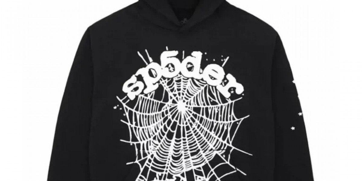
The Sp5der hoodie is instantly recognizable even in a crowded streetwear scene. That recognition comes from a clear and intentional design language that blends bold visuals, cultural symbolism, and modern street aesthetics. Every graphic, silhouette, and color choice communicates something. Understanding this design language explains why Sp5der hoodie feel less like basic apparel and more like wearable identity.
Design Language as Identity
In streetwear, design language is everything. It’s how a brand speaks without words. For Sp5der, that language is loud, confident, and unapologetic. The hoodie doesn’t aim to be subtle or minimal. Instead, it embraces visibility and expression, aligning with streetwear’s roots in youth culture, music, and rebellion.
Sp5der’s designs are built to stand out, not blend in. This mindset shapes every element of the hoodie.
The Spider Motif: Symbolism and Power
At the core of Sp5der’s visual identity is the spider and web imagery. This is more than a logo—it’s a symbol.
Spider represents independence, patience, and control
Webs suggest connection, reach, and dominance in space
In streetwear culture, these symbols translate into confidence and self-made power. The spider graphic often appears oversized, placed boldly across the chest or back, reinforcing presence and authority. It sends a message: the wearer owns their space.
Bold Typography That Demands Attention
Typography plays a major role in Sp5der’s design language. Fonts are rarely clean or corporate. Instead, they lean toward:
Graffiti-inspired lettering
Distorted or stretched text
Hand-drawn or raw aesthetics
This approach connects the brand to underground culture and urban expression. The spelling “Sp5der” itself—with a number replacing a letter adds a coded, rebellious feel, common in street culture and digital identity.
Text isn’t just branding; it becomes part of the artwork.
Oversized Graphics as a Statement
Unlike traditional hoodies that keep branding minimal, Sp5der embraces large-scale graphics. Designs often dominate the garment rather than decorate it.
This oversized approach serves two purposes:
Visual impact instantly noticeable in real life and on social media
Confidence signaling bold graphics reflect bold personality
In streetwear, visibility equals relevance. Sp5der understands this and designs accordingly.
Color Language: High Contrast and Emotion
Sp5der hoodies frequently use high-contrast color palettes. Bright tones against dark bases, or sharp color clashes, create visual tension. These combinations feel energetic and modern, aligning with the fast-paced nature of urban culture.
Color choices often communicate mood:
Dark bases suggest edge and mystery
Bright accents add aggression, youth, or rebellion
Unusual pairings break expectations
Rather than seasonal fashion colors, Sp5der prioritizes emotional impact.
Silhouette: Oversized but Intentional
The fit of a Sp5der hoodie is a key part of its design language. Oversized silhouettes aren’t accidental they’re cultural.
Relaxed shoulders
Dropped hems
Roomy hoods and sleeves
This shape reflects modern streetwear values: comfort, layering, and nonconformity. The oversized fit also gives graphics more space to breathe, turning the hoodie into a moving canvas.
Importantly, the fit feels deliberate not sloppy. Structure balances looseness.
Texture and Fabric as Visual Tools
While graphics catch attention first, fabric quality supports the design language. Heavier materials give the hoodie weight and presence. Thick cotton blends help graphics sit properly and maintain shape over time.
Texture adds depth. The hoodie doesn’t just look bold it feels substantial, reinforcing its premium streetwear status.
Rebellion Without Overcomplication
Sp5der hoodies avoid unnecessary complexity. Designs are bold but not cluttered. This restraint is intentional.
Streetwear thrives on clarity. A hoodie should communicate its message instantly. Sp5der’s design language keeps visuals strong and readable, even from a distance or through a screen.
That simplicity helps the hoodie translate across:
Real-world street style
Social media content
Music and performance environments
Cultural Alignment Over Trend Chasing
Sp5der’s design language is rooted in culture, not trends. Instead of copying runway aesthetics or fast-fashion cycles, the brand draws inspiration from music, youth energy, and underground style.
This gives the hoodie longevity. Designs don’t feel tied to a single season they feel tied to a mindset.
Why the Design Language Works
The effectiveness of Sp5der’s design language comes from consistency. Every hoodie reinforces the same themes:
Visibility
Confidence
Individual identity
Cultural authenticity
When design elements align this clearly, the product becomes more than fashion it becomes a symbol.
Conclusion
The Sp5der hoodie design language is a deliberate blend of bold symbolism, oversized visuals, expressive typography, and cultural awareness. Every element from spider motifs to fit choices serves a larger purpose: self-expression without compromise.
That clarity is why Sp5der hoodies resonate so strongly in modern streetwear. They don’t whisper style. They declare it.


